


Pop Art History
A Review of Edith Young’s Color Scheme

The firm line between academic art history and pop culture art writing has always annoyed me, mostly because I think it’s there to gatekeep the masses of regular joes who like visual culture from accessing substantive analysis and knowledge about it (not that “academic art history” is the only source of knowledge or analysis of art, but still). The line is blurry sometimes - highbrow art essays in the London Review of Books can be just as jargony and dense as a chunky piece of art historical theory, and some academic articles can be genuine page-turners. But mostly, the tone of something peer-reviewed is really different to the tone of a snappy exhibition review or something in Elephant called “Why I Love Monet.” So I was really excited to read Edith Young’s Color Scheme: An Irreverent History of Art and Pop Culture in Color Palettes, since it’s an irreverent history of art - could it do both?
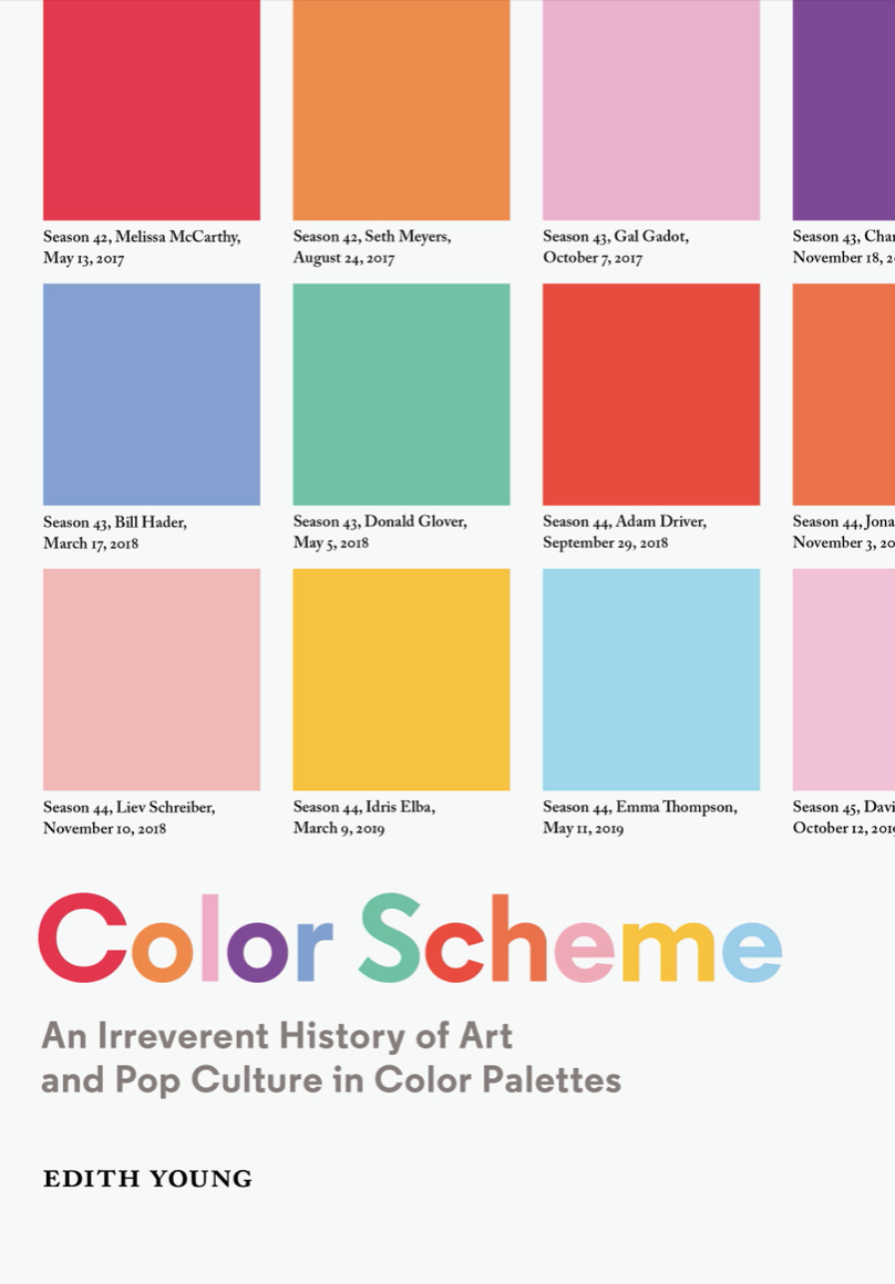
Young’s book is a collection of color palettes, which are gridded collections of colored squares, that represent a group of images or objects. The impetus for her project was a Diana Vreeland quote she came across while an undergraduate at RISD: “All my life I’ve pursued the perfect red. I can never get painters to mix it for me. It’s exactly as if I’d said, ‘I want Rococo with a spot of Gothic in it and a bit of Buddhist temple’—they have no idea what I’m talking about. About the best red is to copy the color of a child’s cap in any Renaissance portrait.” The first color palette in the book is the result of this inspiration, a collection of the different shades of red found in Renaissance caps. Young goes on to focus in her first chapter on “Art History,” including an eclectic range of artists from Vermeer to Alice Neel, then on “Contemporary Art,” starting with David Hockney and ending with Mel Bochner, and finally on “Pop Culture,” where she covers everything from Tonya Harding’s skating costumes to Dennis Rodman’s hair colors. Many of the original images Young is writing about and working on are not reproduced in the book, because image rights are really expensive, which means the effect of the palettes is lost a little bit unless you are highly familiar with the works she is talking about (or Google them, which obviously isn’t hard, but it would be cool if you could easily compare the palettes with the paintings and objects from which their colors are taken).
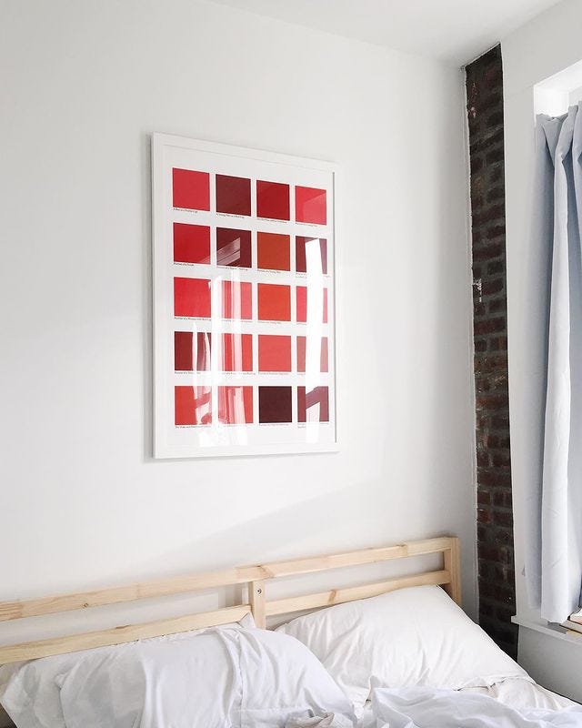
Young mentions the Instagramable-ness of her palettes in her introduction, and clearly that is a huge part of why they have been successful. They are beautiful and visually satisfying as stand-alone pieces of art, which is really what they are. In the book format, particularly in the first two sections on fine art, they are presented as if they might represent a methodological approach to color in art, which left me feeling frustrated with the lack of consistency between the way they were put together, or the explanation of exactly how Young chose a single shade to represent a large section of oil paint (side note: my biggest takeaway from this is that oil paint is incredible, and the reduction of it to Pantone-esque squares only makes you more aware of the richness and variety of color in paint).

But Young is not trying to create a history of color in European and American art. The paintings and artists she chooses to analyze are not a list of the canonical figures of Western art, they are the artists she loves and felt inspired to work on. At one point, she discusses the artistic practice of typologizing, which is really what she is doing. She writes,
Classification by type often invites other rich subject matters into the fold, whether it’s investigating the passage of time, the practice of collecting, or turning a spotlight onto instances of organic mark making and naturally occurring color. Typology encourages an impulse to narrow in on one topic, extrapolate everything you can from a hyper-specific sliver of the world, and become an expert of this niche. At its root, to typologize is to celebrate nuance or the practice of intense observation.
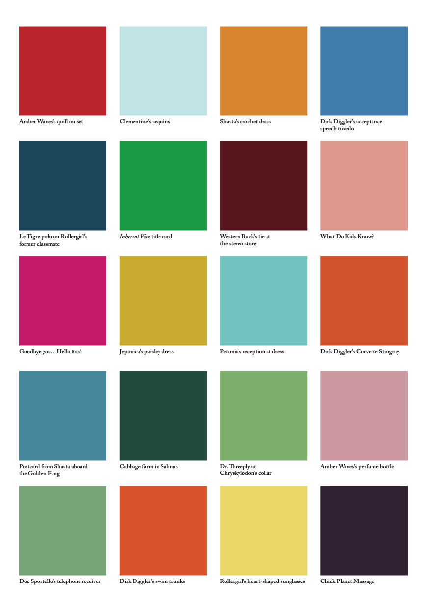
But then, these interesting things that typology can do - investigating the passage of time, the practice of collecting, becoming an expert of a niche - Young doesn’t do. She just categorizes and leaves us, more or less, to look at the palettes and draw our own conclusions. I want to hear what Young’s conclusions are. I can look all day at the colors of the pupils of the eyes in Vermeer’s paintings, which is a really cool category of colors to look at, theoretically, but I want to hear from Young what that offers me that looking at the whole paintings wouldn’t, beyond the aesthetic difference in presentation. The closest she comes, I think, is in her Paul Thomas Anderson palette, in which she chooses colors to “amplif[y] the chromatic eccentricities in Anderson’s Hard Eight (1996), Boogie Nights (1997), Magnolia (1999), and Inherent Vice (2014).” Colors include “Western Buck’s tie at the stereo store,” “Amber Weave’s perfume bottle,” “Doc Sportello’s telephone receiver,” and “Dirk Diggler’s swim trunks.” This apparent randomness coheres into a palette that genuinely conveys a sense of these films, and really demonstrates how Young’s practice can deftly pull out “chromatic eccentricities,” as she puts it.
In the third and final section on pop culture, Young really gets into her irreverent stride. The palettes she chooses are funny and interesting - Dennis Rodman’s hair most of all, but Spike Lee’s eyeglasses is a close second. And her analysis in the introduction to the chapter of contemporary brands’ use of color to maintain a sense of newness, focusing on Le Creuset, Farrow & Ball, Marimekko, and Outdoor Voices, is sharp and interesting. That isn’t surprising, because Young worked for Outdoor Voices and is a designer by training. Young also worked for the now-defunct website Manrepeller, and the whole tone of this book is so reminiscent of that platform (which I read avidly) - trying to sound smarter and cooler than your average female-oriented blog-esque website but also very much built around consumerism and assessing what to buy and why and from whom.
In the caption to one of her palettes in the pop culture section, Title cards from the second season of Saturday Night Live, 1976–77, Young writes, “As an avid fan of the great American institution that is SNL, I became entranced by the early designs of the title cards and wondered if, when seen in aggregate, the color story might tell us something about the approach to television design in the late 1970s.” But that’s all she says. I would be fascinated to read an analysis of what this color palette can tell us about television design in the 1970s - FASCINATED. That sounds like a fantastic use of this methodology/artistic practice. But Young doesn’t do that - she just gives us the palette to reflect on independently. It’s certainly nice to look at, and you can extrapolate something about the vibe of 1970s TV from looking at it, but that’s not the same as actually drawing a conclusion.
I wanted to read this book because I’m so exhausted by the inaccessibility and formality of most academic art history writing, or even non “academic” but still highbrow art history writing, and I was excited to see how Young approached the topic from a completely new angle. I still love the Renaissance red caps palette, which is how I first discovered Young - in fact, I love all these palettes as pieces of art. I think they’re interesting to look at and would look nice on my wall. But this book felt kind of fluffy. It never seemed to decide whether it wanted to be an artist book of Young’s works or a methodological analysis of the history of color. This book is very trendy - the designy-ness of the palettes and the light pop history make it feel like a cool thing to buy. It’s obviously marketable, and written and designed to be so, which results in the whole approach feeling like it’s a sort of meditation on how to make art history feel like something you can purchase. I know I’ve just been complaining about how I want art writing to be more accessible, but I don’t think that has to come at the cost of substance. I hope that’s not the only possibility for pop art history - I hope there is space in that genre, which I think has huge potential, for more depth and rigorous thinking alongside cool design and good writing.
Some Other Things I’m Thinking About
The Copenhagen Trilogy blew my mind
This interview with ICE whistleblower Dawn Wooten hits like It’s A Wonderful Life after they lose the $8,000 but before Clarence gets there
Loved Andy Hayes’s thoughts on how art galleries are appropriating the museum aesthetic without critiquing it
I really liked Conan O’Brien’s interview of Judy Greer, who is so fun and funny and such an interesting Hollywood person
Richard Joseph on the “snarky group chat” of contemporary book reviews and how that has impacted novels
The kind of long-term unpunished but widely acknowledged sexual harassment against people whose careers you can ruin that the case against Harvard professor John Comaroff alleges is exactly the kind of thing I worked on in my brief career in the legal field (lol), and not only do I find it (obviously) depressing and upsetting, but I also find the continued support of Comaroff by academics whose work I read as an undergraduate and whose ideas were (are) foundational to my intellectual worldview pretty revolting.
This rocks lol